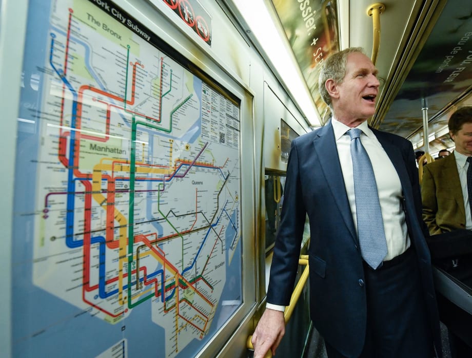
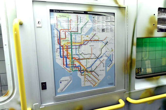
New York Unveils First Redesigned Subway Map in Half a Century
The new map, which draws from previous versions, simplifies riders' primary wayfinding asset while providing the most essential travel information in an easily readable, bright, bold, and orderly manner.
The new map, which draws from previous versions, simplifies riders' primary wayfinding asset while providing the most essential travel information in an easily readable, bright, bold, and orderly manner.
Ad Loading...
MTA’s Path to Modernization
As the MTA continues to modernize its 120-year-old transit system by building new stations, updating signals, making accessibility improvements, introducing a new fare payment system, and improving customer-facing technology, the new map reflects these enhancements.
“The new MTA is focused on a quality, 21st century customer experience, and it’s about time our map caught up,” said MTA Chair/CEO Janno Lieber. “The new version is much easier to read while also reflecting all the enhancements we’ve made over the years.”
The new map was designed by the MTA’s Creative Services Mapping Department and, like many major subway systems around the world, utilizes a diagrammatic style, employing bold, straight lines making it much easier for the eye to follow and more suitable for digital users.
The white background, bold colors, horizontal writing and use of black dots make the map more ADA-friendly and easier for people with low-vision or cognitive disabilities to read.
Designers also focused on text legibility, keeping text on one line wherever possible and making better use of open space to alleviate crowding and using a black subway bullet with a white character to provide maximum contrast for easier reading.
Ad Loading...
The legend on the map is now more detailed and includes accessibility, transfer, and safety information, as well as a QR code that leads users to the MTA website.
Drawing Inspiration from Older Maps
Although this map is a new design, the creative team drew inspiration from previous maps including:
Preserving the official brand colors established by the 1979 and 1998 Hertz maps.
Using a similar geometric and diagrammatic aesthetic introduced to the New York City Subway with the 1972 Vignelli diagram and revived by its successors, Waterhouse Cifuentes.
The new subway map for weekdays, late nights, and weekends is already displayed on station digital screens and soon will be onboard R211 cars. Replacing physical maps in the remaining subway cars will be done in phases over the coming weeks.
The MTA plans on celebrating the redesigned map throughout 2025. Both the redesigned map and older versions will be available for download on the MTA website.
Ad Loading...
The new map was designed by the MTA’s Creative Services Mapping Department and, like many major subway systems around the world, utilizes a diagrammatic style, employing bold, straight lines making it much easier for the eye to follow and more suitable for digital users.
Photo: Marc A. Hermann
Digital Upgrades as well
Customers are also seeing a software redesign of digital subway station screens that increase the frequency of real-time data, updating every five seconds, to better match countdown clocks to real-time train arrivals.
The improvements, based on customer feedback, surveys, and analysis of all 472 stations, prioritize arrival information, streamline the presentation of customer information, and consistently feature white text on a black background for improved clarity and visibility.
Crews increased the number of screens that flash to alert customers when a train is approaching and feature an arrow on overhead digital screens that point to the side of the platform where the train is arriving.
New vinyl stickers will also indicate which side of the screen contains information and which side displays advertisements. Screens at all stations are monitored remotely via cloud technology and can instantly alert crews to a malfunction, eliminating the time-consuming step of manually reporting issues.
See how World Cup matches are generating record transit demand across North America, with ridership surpassing Super Bowls, concerts, and Olympic-era events.
Approved by the Commonwealth Transportation Board, the program supports ongoing infrastructure projects while providing new investments in transit, state of good repair and transportation alternatives.
The selected host organization will showcase its transit system, projects, and community while welcoming hundreds of industry leaders and emerging professionals during Hispanic Heritage Month.
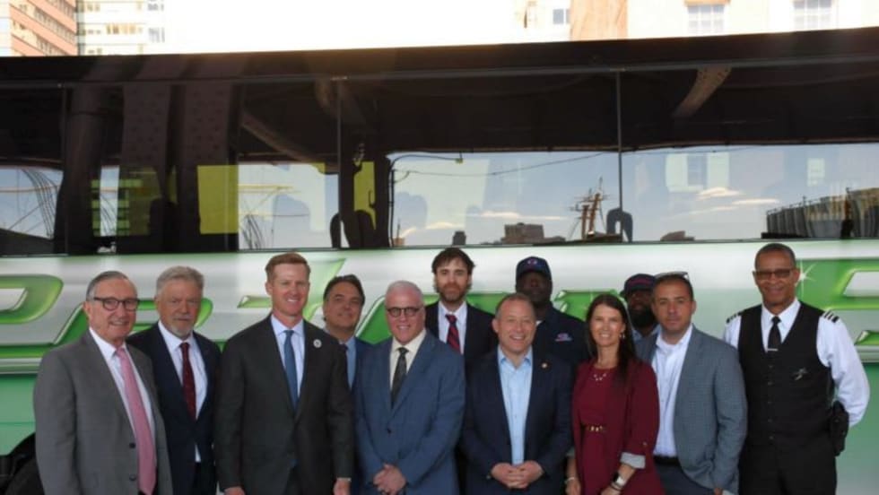
Backed by motorcoach operators, the legislation seeks to balance emissions goals with passenger safety by allowing limited idling for inspections, accessibility needs and extreme weather conditions.
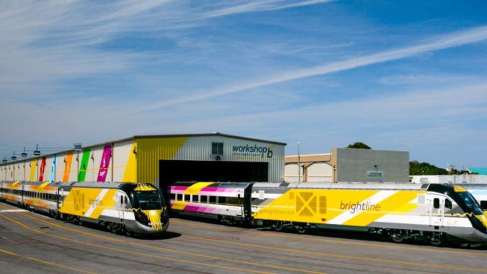
Safety improvements funded through a $25 million federal investment are credited with reducing trespassing and train-vehicle collisions along the Brightline Florida corridor.
Weekend rail ridership was especially strong, soaring 18% as riders embraced expanded access to jobs, entertainment, dining, and cultural destinations, said the agency. Total system ridership for May, including bus and rail, was 26,966,657.
NYMTC’s quarterly Travel Patterns Report provides a snapshot of travel activity throughout New York City, Long Island, the Lower Hudson Valley, and northern New Jersey using data collected from the agencies operating the region’s bridges, tunnels, and public transit systems.
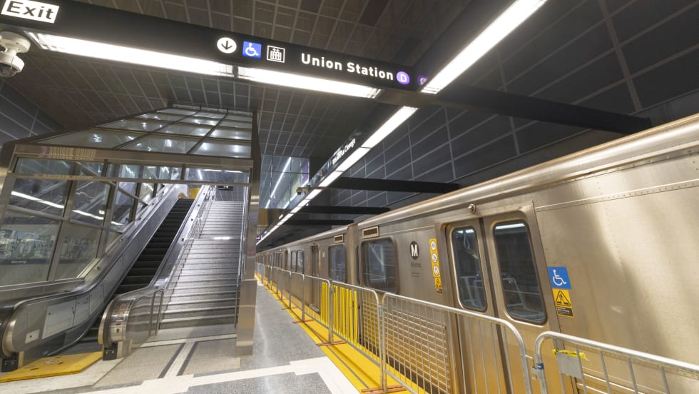
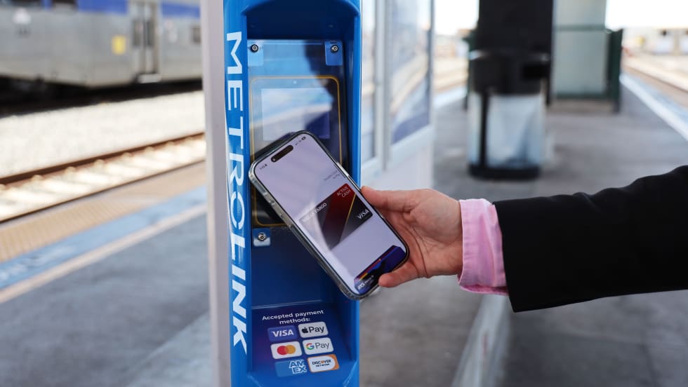
Customers traveling between Redlands and Los Angeles can now tap their preferred payment method, including a credit or debit card, mobile wallet, or wearable device, at station validators before boarding and again while exiting.
The budget covers July 1, 2026, through June 30, 2027, a period when pandemic emergency funds run out, the District faces a structural deficit of $375 million, and a regional transit funding measure may appear on the November ballot.