5 things to consider when naming and designing brand identities
As cities work to become more relevant to new generations and attract diverse visitors, ensuring transit systems’ naming and branding systems are well-designed will become increasingly important.

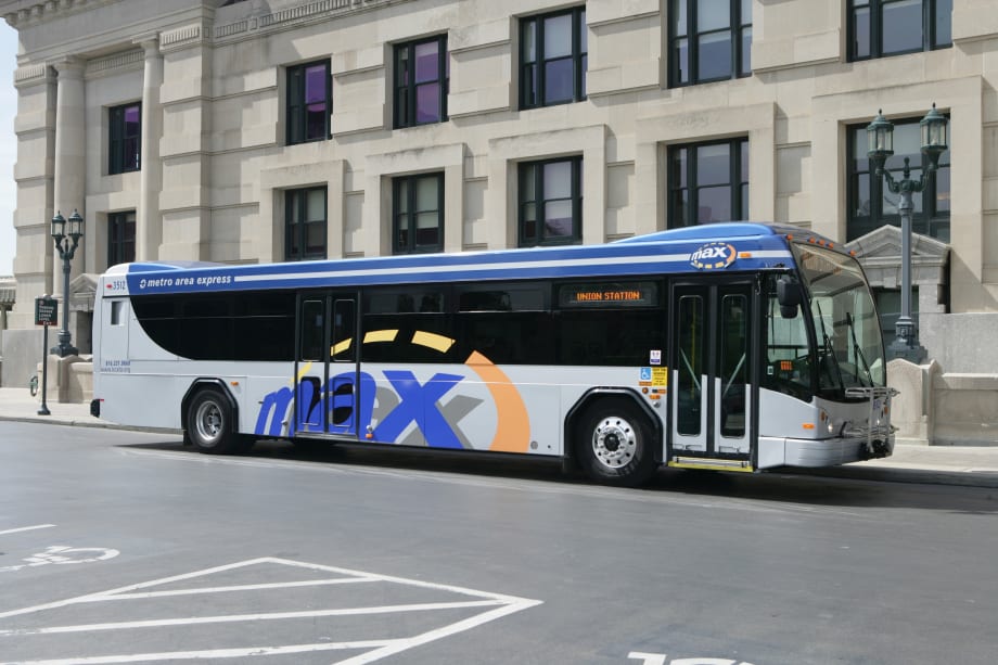
When branding, it’s important to keep things simple, which was a key consideration for the Kansas City Area Transportation Authority’s bus rapid transit system.

As cities work to become more relevant to new generations and attract diverse visitors, ensuring transit systems’ naming and branding systems are well-designed will become increasingly important.
That’s because people who gravitate toward these more dense urban centers do so in part because they want everything at their fingertips. They don’t want to have to own a car to get to work — or play. For these people, your transit system becomes an integral part of their everyday lives. For visitors and tourists, a well-designed system ensures they will be able to discover and enjoy all that your city has to offer.
Here are five things you need to consider when naming and branding your transit system:
Unity. Optimally, the new transit name and brand should be capable of working in unison with all operators across all of your transit lines — even if you are just rebranding one mode of transit right now. Why? Riders are looking to get from point A to point B in a timely and convenient manner and sometimes this requires using more than one mode.
Connecting the modes with uniform visual and verbal cues will make the transition between modes easier for riders. This also enables you to begin extending that unified experience to transit information systems such as the signage, website, map and smartphone applications. For example, New York City Bus uses the same brand language as New York City Subway, and both live under the MTA brand.
Expansion. Naming schemes should be flexible and extensible enough so that they can expand and adapt as lines and services are added or decommissioned. Studies exploring how the name and brand could be applied in these scenarios should be part of the design process and standards developed to guide future needs.
Flexibility/extensibility becomes extremely important when naming routes and lines. For example, using color can be a problem if the system grows to the point that you run out of colors. It’s also important to consider if the city will benefit from a very rational route system (A line, B line, C line, etc.) or if you want to get into naming routes after people and places. A note of caution — the latter approach can become political and names can become irrelevant over time.
Simplicity. In examining the branding of major transit systems all around the world and speaking directly with many of their leaders to understand their challenges — and what they would do differently — we found that the bigger the city and more complex it is, the simpler the brand and signage system needs to be. Simplicity in transit branding is essential.
Don’t be surprised, however, if initially you encounter resistance, as many people equate simplicity with lack of creativity. Nothing could be further from the truth. Consider the universal and iconic stop sign. It’s simple, memorable and extremely effective. Communicate this to your public, but hold your ground. You’ll thank us later. Transport for London is a best practice for its simplicity.
Function. When vetting names it can be helpful to create a list of criteria. Here are a few examples: Will riders immediately understand what it is? Does it work with a pure and directional URL? Does it fit with the native nomenclature, in other words, the words people are already using to refer to your system? Does the name reflect what the rider is looking to do? It’s also important to keep in mind that the best looking design in the world will fail to create the desired user experience unless its first consideration is the transit user.
Pride. Transit is extremely visible and thus what it looks like (and how it works) is a constant reminder to citizens and visitors of what your city thinks of itself. When considering a new brand identity direction, take inspiration from art, architecture, colors, imagery and voice from the surrounding environment that helps define your city, but also look at consumer products and imagery that convey the impression you are looking to achieve. Paris RATP, for example, combined a very simple and clean Parisian aesthetic application to its fleet with an artistically-driven mark to create a unique brand for Paris.
A unified, flexible, simple and functional transit naming and branding design that reflects your city in its best, most aspirational light will serve as source of civic pride for years to come. Ensuring the transit communications serve user first, however, is ultimately what will help your city really go places.
Megan Stephens is president and partner at Willoughby Design,
a brand strategy and design firm with offices in San Francisco
and Kansas City. mstephens@willoughbydesign.com.
More Bus
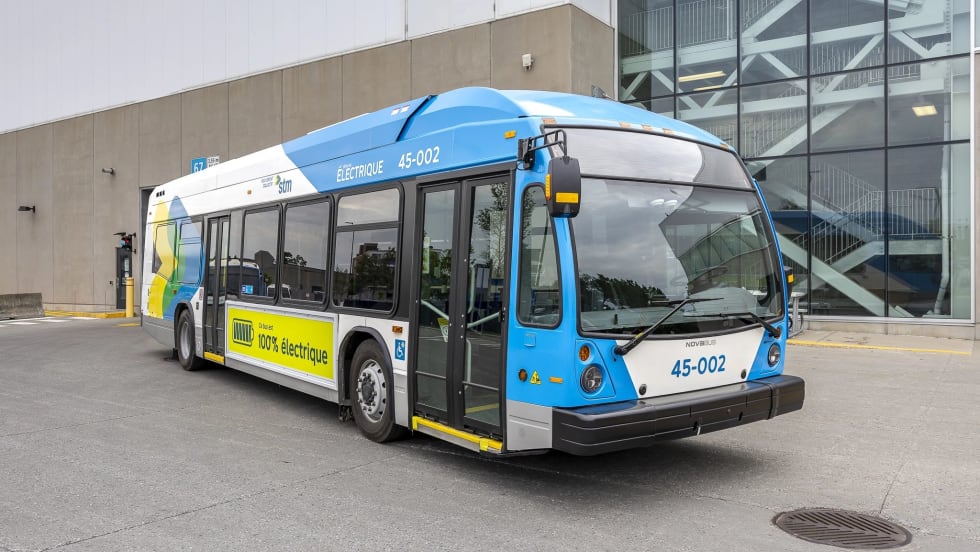
Biz Briefs: Montréal Debuts Nova Electric Buses and More
In this edition of Biz Briefs, we spotlight the latest developments shaping the future of mobility.
Read More →
The Hidden Cost of Fuel Data Inaccuracy in Public Transit Fleets
In today's transit environment, accurate fuel and mileage data are critical to reducing costs, minimizing downtime, and improving fleet performance.
Read More →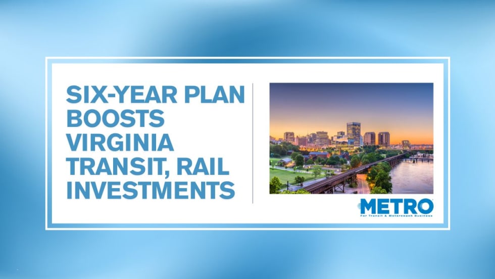
Virginia's $28.5B Transportation Plan Targets Transit and Rail
Approved by the Commonwealth Transportation Board, the program supports ongoing infrastructure projects while providing new investments in transit, state of good repair and transportation alternatives.
Read More →
Bipartisan BUSES Act Seeks Changes to New York City's Bus Idling Enforcement Program
Backed by motorcoach operators, the legislation seeks to balance emissions goals with passenger safety by allowing limited idling for inspections, accessibility needs and extreme weather conditions.
Read More →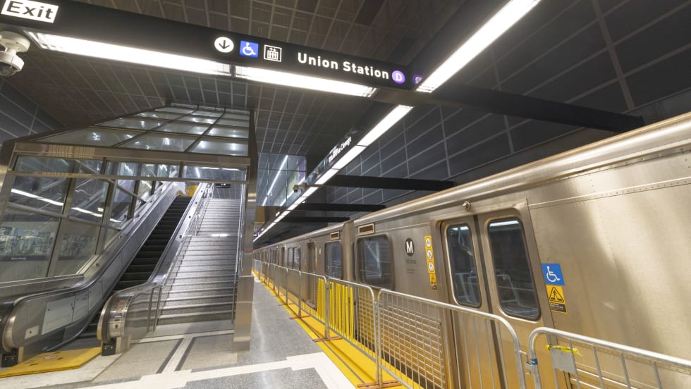
D Line Expansion Fuels Growth Across LA Metro's Rail System
Weekend rail ridership was especially strong, soaring 18% as riders embraced expanded access to jobs, entertainment, dining, and cultural destinations, said the agency. Total system ridership for May, including bus and rail, was 26,966,657.
Read More →
ENC to Deliver Three Clean Diesel Buses to Canada's York Region Transit
Since 2005, City View and ENC have supplied nearly 90 E-Z Rider II buses to YRT.
Read More →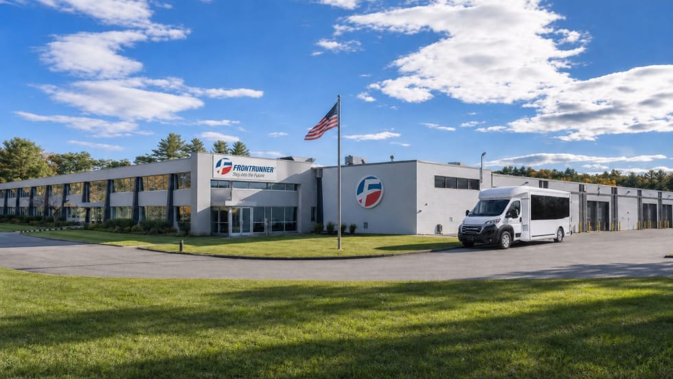
Frontrunner Bus Group Expands with New Massachusetts Headquarters
The significantly larger facility will provide the infrastructure needed to support the company’s growing workforce, advanced technologies, and expanding product line.
Read More →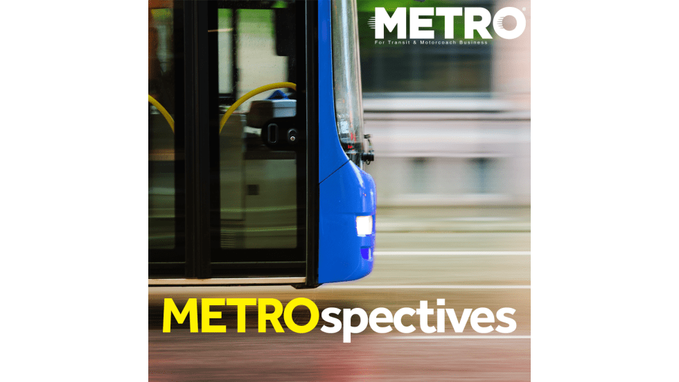
Joshua Schank on Transportation Innovation, Risk, and the Future of Mobility
In this edition of METROspectives, Joshua Schank discusses lessons from launching LA Metro’s Office of Extraordinary Innovation, the challenges of advancing new mobility technologies, and much more.
Read More →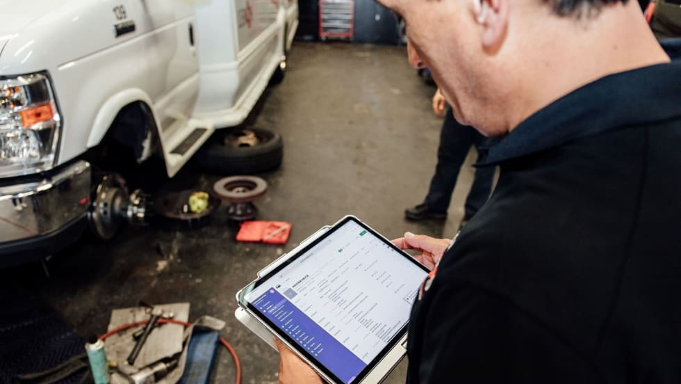
Reinventing Fleet Maintenance with Real-time Visibility and AI
Transit leaders need to know what needs fixing, where to look, who is responsible, when work is completed, and what it costs without having to chase information across disconnected systems.
Read More →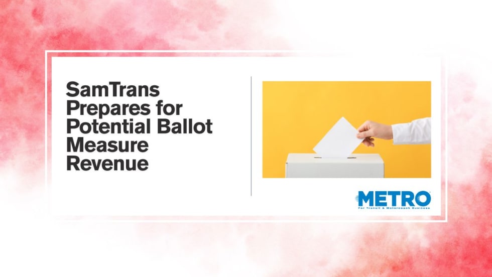
SamTrans Sets Priorities for Potential Connect Bay Area Revenue
The board-approved framework allocates future funding to maintaining service, rider improvements, equity initiatives, and infrastructure repairs.
Read More →